
Where Grounded Works—and Where It Overwhelms a Kitchen
Preview Behr Grounded on MDF and wood-grain cabinets, then compare light, sheen, counters and hardware before choosing an island or full kitchen.
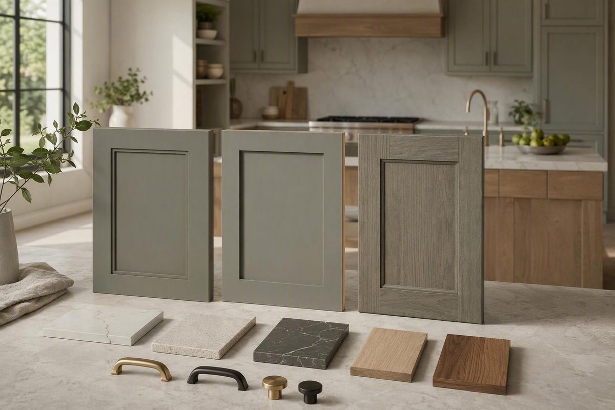
Behr Grounded works best as a lower-cabinet or island color, especially with a light counter and restrained door style. Its olive-to-brown shift makes it riskier across every cabinet run, where low light can turn the effect heavy or muddy. Treat Grounded T27-01 as a color choice, then have it mixed in a cabinet or trim enamel explicitly approved for your door material; availability in a wall-paint line does not establish cabinet durability.
Choose the cabinet placement, surface, light and fixed finishes; the preview and verdict update together.
Grounded Cabinet Previewer
This schematic compares placement and undertone pressure; it is not a color-matched rendering.
Verdict: A workable, lower-risk use of Grounded.
Lowers keep the olive below eye level. North or dim light may reveal more brown, while the soft-white counter and brass provide useful relief and warmth.
| Choice | Likely Reading | What to Check |
|---|---|---|
| Island | Contained olive focal point | Pendant light at the island |
| Lowers | Earthy base, lighter sightline | Color assignment for tall units |
| Uppers | Stronger eye-level color | Shadow beneath cabinets |
| All cabinets | Enveloping and visually heavy | Brown shift across repeated doors |
| North / dim light | Deeper, browner or muted | Darkest corner and evening use |
| Bright south light | More yellow-olive | Contrast with white counters |
| Warm night light | Brown undertone more apparent | Bulbs and under-cabinet lights |
| Visible wood grain | Organic, less uniform | Texture and profile shadows |
| Satin | Moderate, softer reflection | Product approval and cure data |
| Semi-gloss | Sharper highlights | Surface and application defects |
| Light counter | More breathing room | Warm versus stark white |
| Dark counter | Dense, dramatic palette | Floor and room brightness |
Source: Behr’s published Grounded description and pairing guidance; cabinet-placement and material verdicts are Cabinet Facts editorial assessments. No verified Grounded RGB, LRV or cabinet durability figures were available.
The preview is schematic rather than color-accurate. No verified light-reflectance value, RGB formula or cabinet-specific test data for Grounded appears in the available evidence, so a screen cannot replace a painted sample.
Grounded Reads Olive by Day and Browner at Night
Behr describes Grounded, its 2027 Color of the Year, as an earthy green moving between olive and moss with subtle brown undertones. It is warmer and browner than a clear botanical green, but it remains recognizably greener than taupe or neutral brown.
That balance gives it useful range on cabinetry. It can connect visually with wood floors, warm stone and aged-looking metals without becoming as sharp as emerald, blue-green or a clear forest green. On a large bank of doors, however, the brown component has much more opportunity to dominate than it does on a small color chip.
Grounded was reportedly formulated for the Color of the Year designation rather than selected from Behr’s existing library. Behr’s head of color connected it with olive shades popular in the 1960s and 1970s and said brighter daylight can make it appear yellower and more olive, while its brown undertones may become more apparent at night, according to Forbes’ report on the color.
That shift is directional guidance, not a controlled test on cabinet doors. Window exposure, exterior shade, bulbs, under-cabinet lighting and reflected color from the floor and counter can change the result.
In a north-facing or dim kitchen, expect Grounded to have a greater chance of reading deep, brown or muted. In strong south light, its olive and yellow-green side may become easier to see. Neither result is guaranteed, which is why the same sample needs to be checked on each cabinet zone rather than only beside a window.
Lower Cabinets and Islands Contain the Visual Weight
Grounded is most forgiving when its placement follows the kitchen’s architecture. Randomly alternating door colors fragments the room; assigning the color to a complete horizontal or functional zone makes the choice look deliberate.
| Placement | Likely Effect | Main Risk |
|---|---|---|
| Island | Concentrated focal point | Different pendant light |
| Lowers | Color below eye level | Tall-unit assignment |
| Uppers | Strong eye-level olive | Shadow and heaviness |
| All cabinets | Enveloping composition | Brown undertone multiplies |
An island is the lowest-commitment application. It can bridge neutral perimeter cabinets, wood seating, a light counter and warm metal pendants. Test the sample at the island itself: central fixtures may illuminate it very differently from doors on the wall.
Grounded lowers with lighter uppers preserve brightness near eye level while giving the room an earthy base. Decide whether refrigerator panels and pantry towers belong with the lighter uppers or the Grounded bases. Leaving that decision until painting begins usually produces an awkward break.
Grounded uppers can work when the wall cabinets are limited, well lit or surrounded by pale finishes. They are less forgiving in a compact kitchen with tall, continuous cabinetry because the deepest color sits directly in the main sightline.
Using Grounded everywhere is the highest-risk version. It suits a bright room intended to feel enveloping, but every door, drawer front, filler, end panel and molding repeats the undertone. A shade that looks only slightly brown on one sample may feel predominantly brown when it covers the full room.
MDF Looks Smoother While Wood Grain Adds Movement
On smooth MDF, Grounded should read as a relatively continuous field of color. That makes the olive-to-brown change easier to attribute to lighting and adjacent materials. Routed profiles and door edges will still create shadows, but the broad face will not introduce natural grain movement.
Wood doors can retain visible grain or texture beneath an opaque coating, depending on species, preparation and the finishing system. That texture creates small highlights and shadows, making Grounded look less uniform. Open or pronounced grain can push the result toward a more organic, furniture-like appearance; it can also make an already complex palette feel busier.
MDF is often used for painted center panels because it avoids the seasonal shrink lines that can appear at the edges of a solid-wood panel. That is a construction option, not a universal specification. Confirm how the actual door is built and whether its manufacturer permits field refinishing.
Door profile changes the period signal as much as substrate. A slab or restrained frame keeps Grounded cleaner and more contemporary. A detailed raised panel strengthens shadows and can make its 1960s–1970s olive association more apparent. A raised panel is not automatically dated; the surrounding overlay, hinges, hardware and surfaces determine the result. See Raised Panel Cabinet Doors Can Look Current for the construction and styling distinctions.
Thermofoil, laminate, factory-cured finishes, veneer, bare wood and previously painted MDF are not interchangeable substrates. A coating that adheres to prepared wood may not be approved for a slick factory surface. Identify the door material before selecting primer or enamel.
Satin Is the Safest Visual Starting Point
For most Grounded cabinets, satin is the practical visual default. Its moderate reflection keeps the olive color readable without turning every profile, grain line and surface flaw into a bright highlight. This is a design recommendation, not a finding from a Grounded durability test.
Semi-gloss produces stronger highlights and can give detailed doors a crisper, more traditional appearance. It may also reveal sanding marks, dents, grain and application defects more readily. Use it when that sharper finish is intentional and when the exact cabinet coating offers the sheen.
Do not infer durability from sheen alone. Washability, blocking resistance, grease resistance, chip resistance and cure behavior come from the complete coating system. The available sources do not provide independent cabinet tests or long-term Grounded installations, and they do not establish a best-performing Behr line or sheen for doors.
Grounded is reported as available in Behr Dynasty, Marquee, Ultra and Premium Plus. That means those families can supply the color; it does not mean every product is approved for kitchen cabinetry. Behr’s limited one-coat hide guarantee applies only to eligible Dynasty or Marquee interior products tinted to designated one-coat colors. It should not be extended to cabinet substrates without explicit current documentation, as the company announcement’s qualifications indicate.
Select a cabinet or trim enamel whose current label and technical data sheet explicitly cover the existing substrate. Verify its required cleaner, deglossing or sanding process, compatible primer, application method, recoat interval, handling time, rehang time, blocking resistance and full-cure instructions. If the documentation does not address the surface, obtain written guidance from the manufacturer rather than substituting a generic painting timeline.
Light Counters and Warm Metals Give Grounded Breathing Room
Behr’s strongest pairing guidance points to most wood tones and warm metals such as brass, copper and gold. Its broader palette places Grounded with warm neutrals, earthy and clay colors, muted pinks and soft or airy blues. These are palette directions, not proof that a specific slab, tile or stain will coordinate.
A soft-white or warm-white counter is the easiest way to offset Grounded’s visual weight. A stark white can also work, but the sharper contrast may make the cabinet color appear yellower, browner or more olive. Compare the actual slab rather than relying on a product name or online image.
Warm stone with beige, cream, rust, brown or clay movement can connect to Grounded’s earthy side. The risk is undertone accumulation: warm stone, cream tile, orange-toned floors and olive cabinets can become murky when none provides relief.
Pale oak offers that relief while retaining a natural palette. Medium and walnut-toned woods make the composition richer and darker. Check red, orange and gray casts in the wood because each can pull a different aspect from Grounded.
Brass, copper and gold reinforce the warmth. Black hardware creates a firmer outline and suits simple doors, though extensive black flooring, counters and fixtures can make the room dense. Nickel and stainless steel create cooler contrast; they are not prohibited, but they can expose the yellow or brown component more strongly.
Behr’s named coordinating suggestions include Denim Light, Sedona Pink, Cocoa Nutmeg, Tuscan Terra, Fresh Tone and Blue Moon Bay. Treat them as manufacturer palette ideas rather than required companions.
A Door-Size Sample Settles the Color Decision
Grounded carries the color code T27-01. Behr reports that free color chips and 8-ounce paint samples are available through The Home Depot, while 9-by-15-inch peel-and-stick samples are offered through Samplize, according to the syndicated company announcement.
Use the peel-and-stick sample to reject clearly unsuitable placements, not to approve the final cabinet finish. Once an appropriate coating has been identified, prepare a painted, door-size vertical sample with the intended primer, enamel, sheen and application method. Include an edge or profile so the sample creates realistic shadows.
Place it directly beside the counter, backsplash, floor, wall, appliances and intended hardware. Check it on the island, below the counter, at upper-cabinet height and near tall pantry units. A sample that stays olive on a bright island may become much browner against a shadowed wall.
Observe it in morning, midday and evening light, then with every fixture normally used at night. Note whether it becomes too yellow, loses too much green, turns muddy beside the floor or feels too heavy in the darkest corner. Those repeated observations are more useful than a favorable moment in direct sun.
The approval has two separate parts: the sample must work with the kitchen’s fixed materials, and the coating system must be approved for the exact cabinet surface. Passing only one of those tests is not enough.